Foodee
2023
Brand Refresh
Over the years, the Foodee brand had shifted a number of times. When I was brought in to work with the company in the early 2020's, the time was ripe to help them define the kind of qualities that would help them speak to a broader audience.
Context
The early days of a Foodee brand
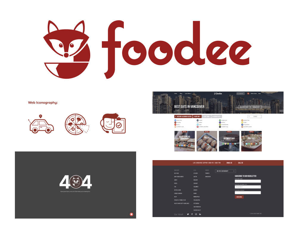
Foodee as a company began somewhere around 2014, with the goal of solving complex food problems for large group events and corporate clients. The early days were scrappy, as I'm told, and this resourcefulness was the main quality that gave this team its competitive edge. Naturally, this served as the rationale for its first logo, a friendly fox who embodied that resourcefullness.
The original brand design
Early updates to the brand
Designers before me were pushing Foodee away from the fox mascot and taking the brand towards a friendlier vibe. This left only the stylized wordmark and a brighter color palette. These were welcome updates, and greatly improved on the heaviness of the old brand, but the team was still hoping for a more flavorful presentation.
Brand refresh
A new look with more flavor
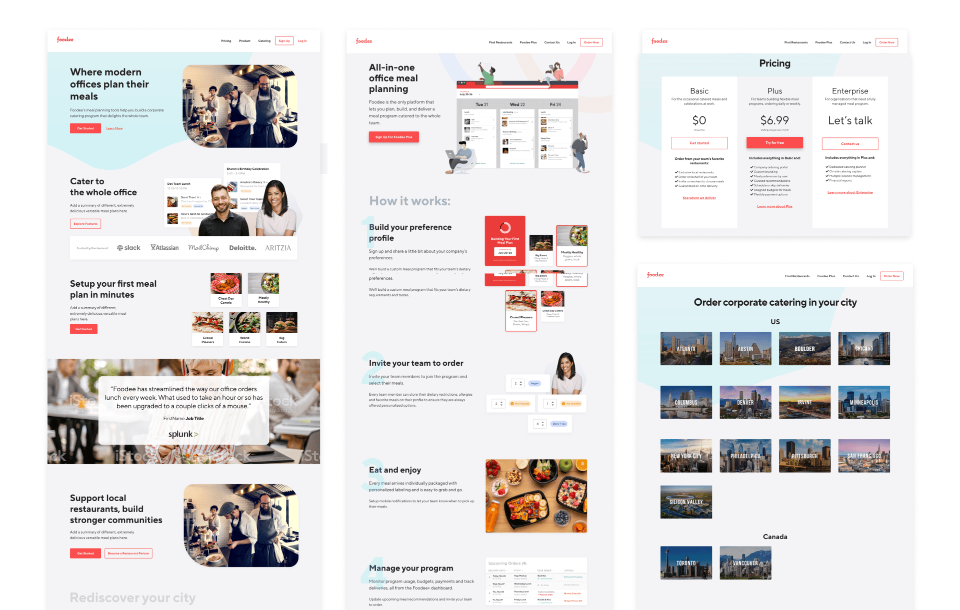
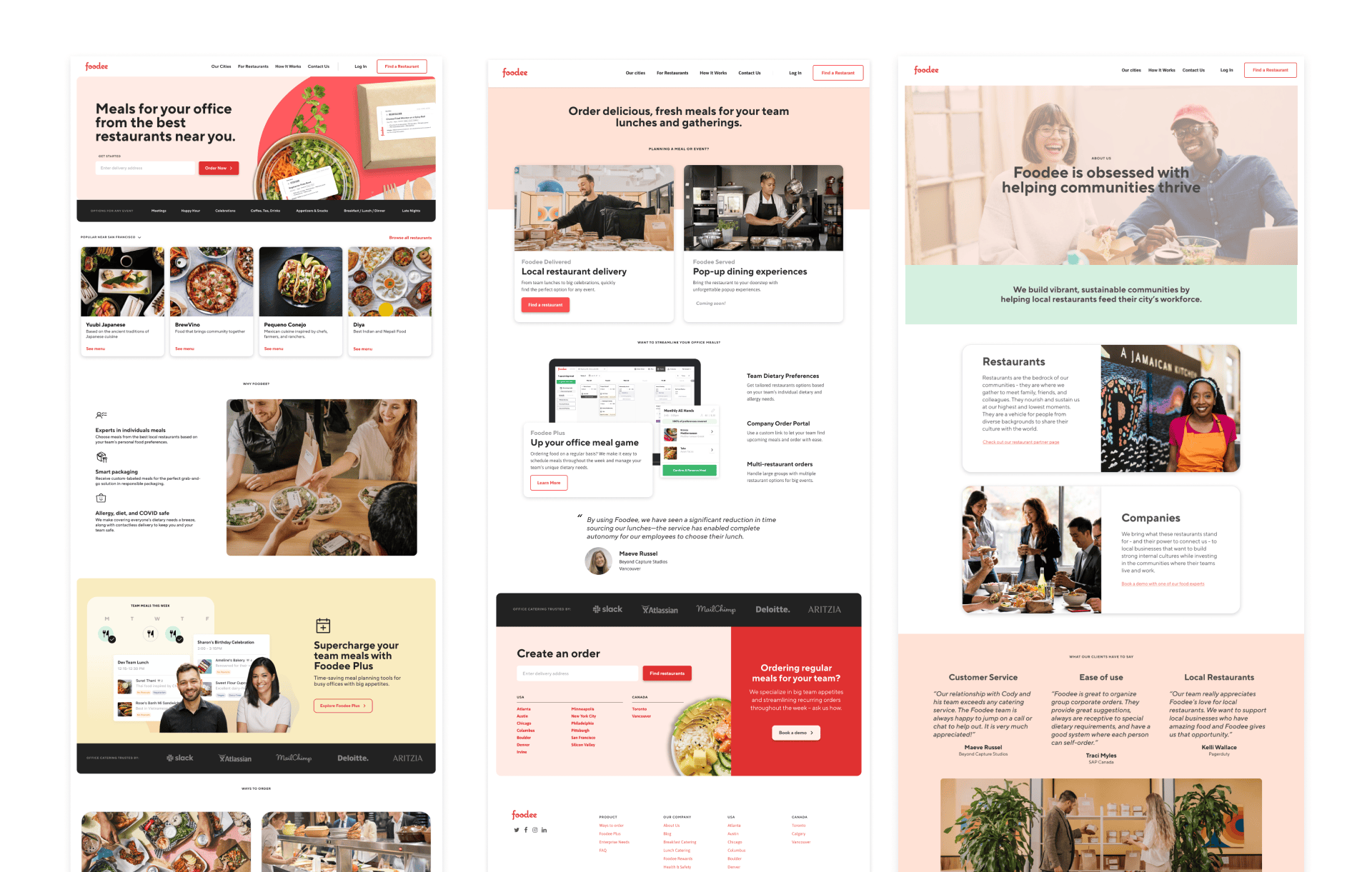
When I started working at Foodee full-time in 2021, I began guiding a redesign of the marketing site that would include punchier colors, stronger typography, and more refreshing visuals. At this point, the brand was starting to take shape to match the positive and engaging energy of the team.
Warming up the website
Targeting the color palette, we integrated warmer, saturated colors to replace the older grey backgrounds. Any outdated stock imagery was also targeted for an update with more refined imagery along with new marketing pages aligned with the new look.
Refreshing the logo
The original wordmark was approachable, but suffered from challenging design details. It was due for a fresh take but I was mindful not to completely upend a brand with nothing overtly wrong about it other than feeling a bit stale.
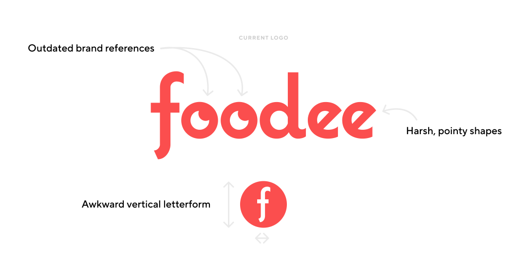
A big overhaul to the logo would never fly, so changes were subtle and strategic. The logo largely stayed the same, which gave us team a great deal of flexibility in rolling it out. Our thinking was that if you ever saw the two next to eachother (which was likely to happen given that focus on a rebrand was limited) you wouldn't necessarily think much of it.
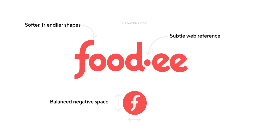
The most significant update was a simple dot added to break up the wordmark. It added just enough visual interest to liven up the text, while also reminding people of our unexpected spelling and website domain.
Further Updates
Fleshing out the brand
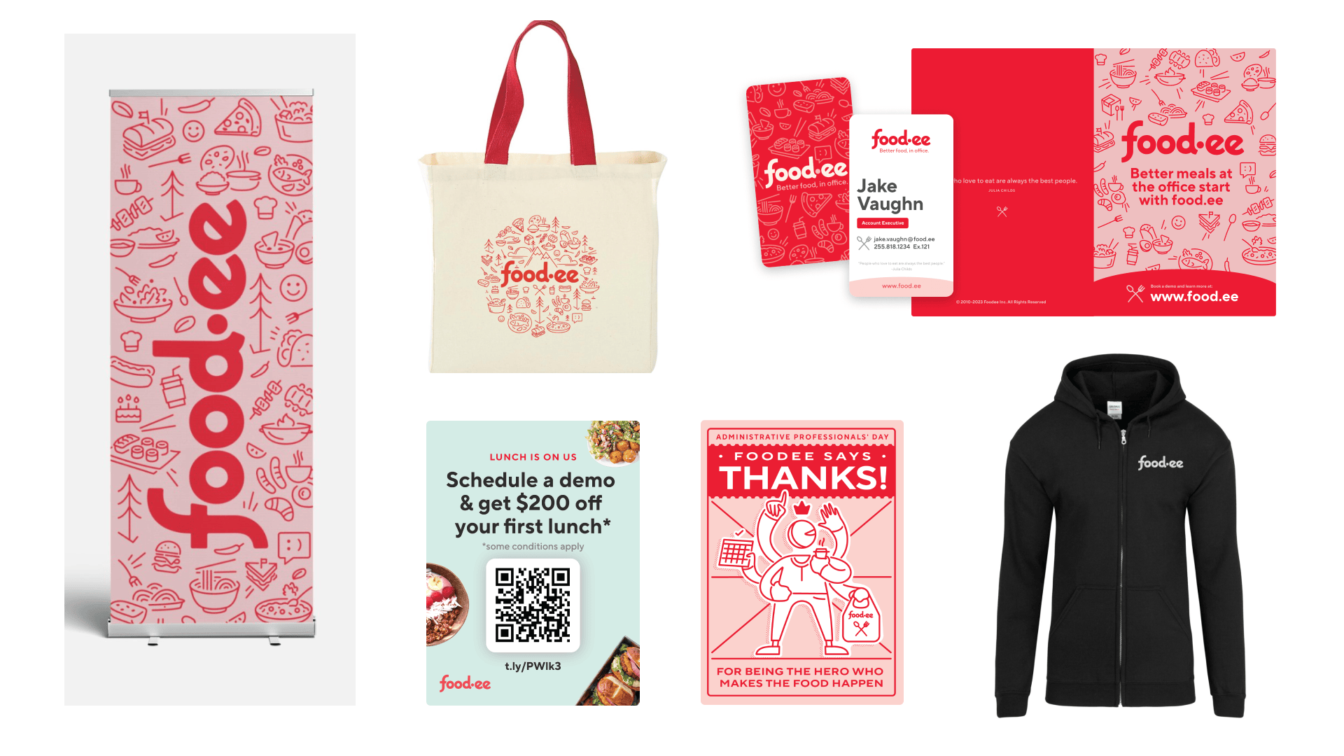
With the creative direction in a good spot and the brand elements nicely defined, we continued to work this new personality into more areas of the app and marketing materials. This refreshed look of a bright and simple brand had the right kind of energy that would show customers that Foodee is a brand who "gets it".
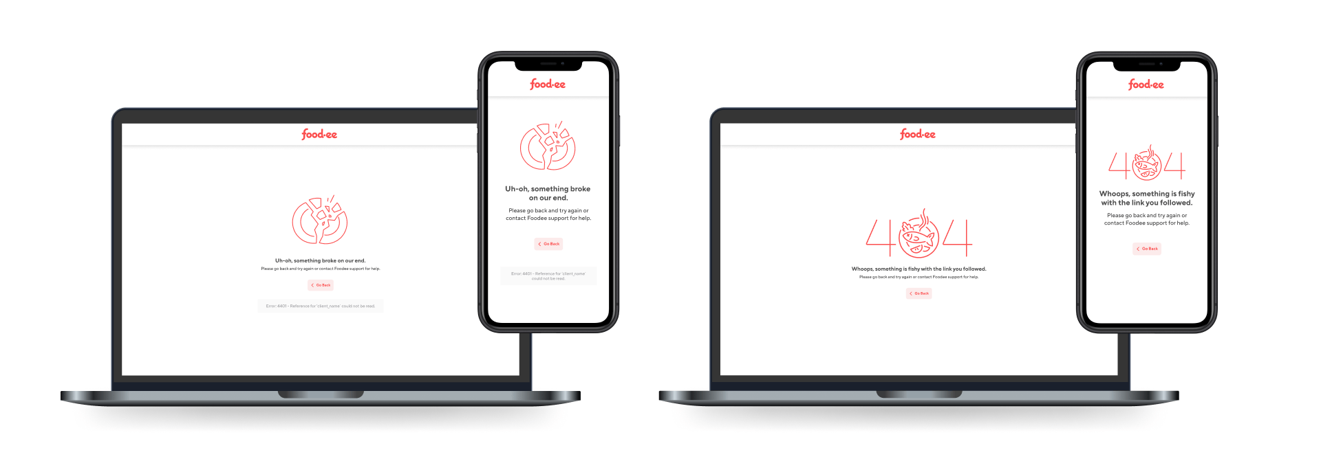
Error page designs
New brand swag and print materials
