Foodee
2023
Product Design
UX Improvements
Summary: I worked with PMs, sales, and success team to update the existing account onboarding workflow to improve first-order conversion rates.
The Problem
Ineffective account onboarding
The product team had known for some time that the existing self-led Foodee Plus signup flow was not working. Signup completion was exceedingly low, and if you ever managed to figure out how to schedule an order, our success team had no clear process for helping these self-signup accounts.
With an increased focus on utlizing the sales team to improve success for new Foodee Plus accounts, we had the opportunity to repurpose this workflow in favour of supporting this new sales-led onboarding process.
Existing account setup flow
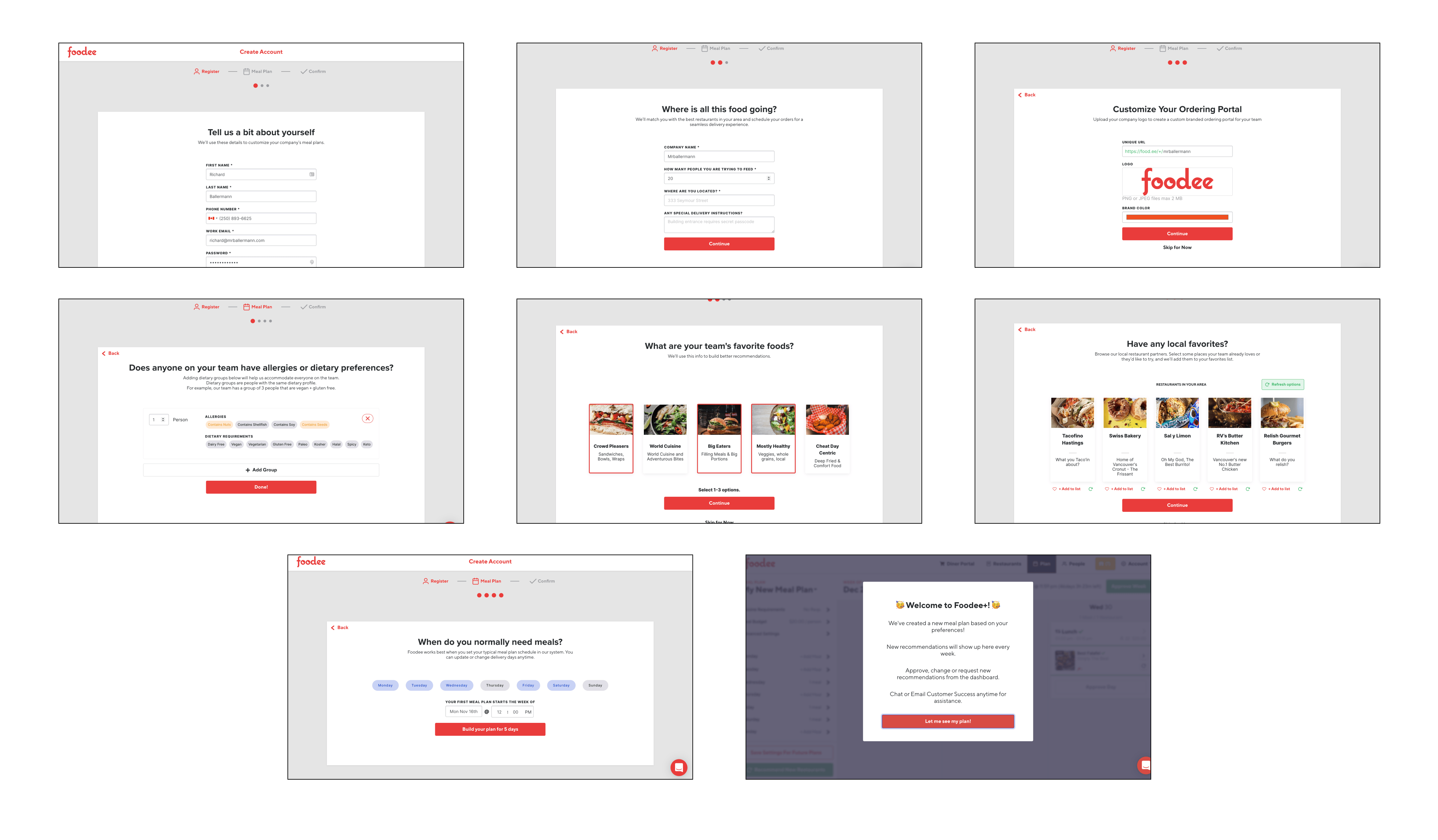
This was designed as an account set up wizard which would gather details needed to start placing orders. As a user experience, it feels like a lot of work right off the bat and asking one person to define the eating preferences for 50+ people felt counter to a core promise of using team data to provide better suggestions.
All this resulted in a signup flow that simply didn't work, and the metrics reflected that.
Onboarding conversion metrics

What the data told us:
• less than 1% of users finished the signup process
• most onboarding steps were being skipped
• those that did finish never placed an actual meal order
Our Approach
Aligning on a strategy
The product team was confident we could improve the existing account onboarding workflow, but the time and effort required led us to a decision that the sales team would be a quicker solution for managing new account signups. At the very least we knew the current flow should be removed as it was rarely used never resulted in successful orders anyway.
The sales team walked us through their process so we could identify opportunities to support them with strategic changes to the signup flow. This exposed an unexpected step for new customers that we agreed should be addressed.
An awkward introduction
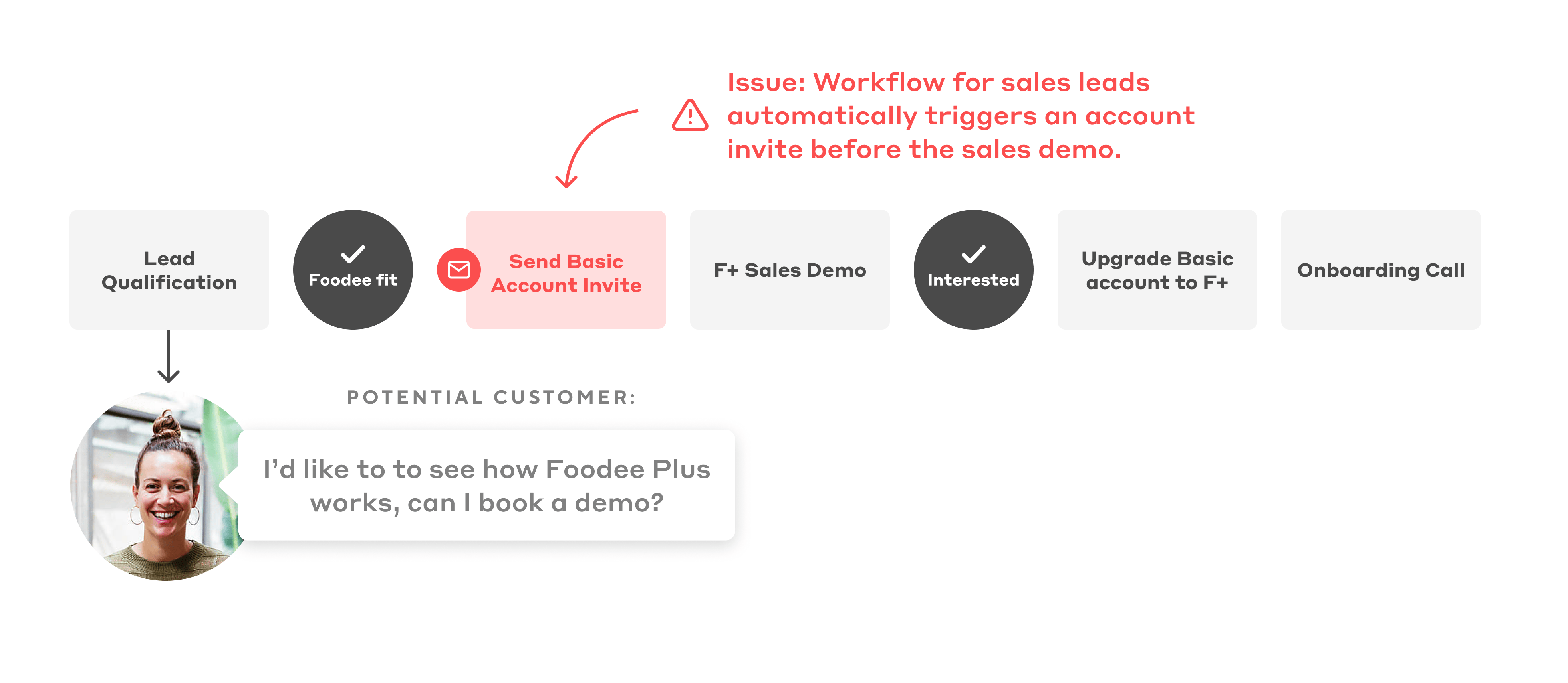
From the user's perspective, this account invite was first official experience they'll get with our service. It wasn't particularly appealing to look at, and wasn't expected considering a lead had requested a meeting to see a demo. If leads followed this invite prior to the demo call (many did) the product they see is noticeably different from the one the sales team would demo.
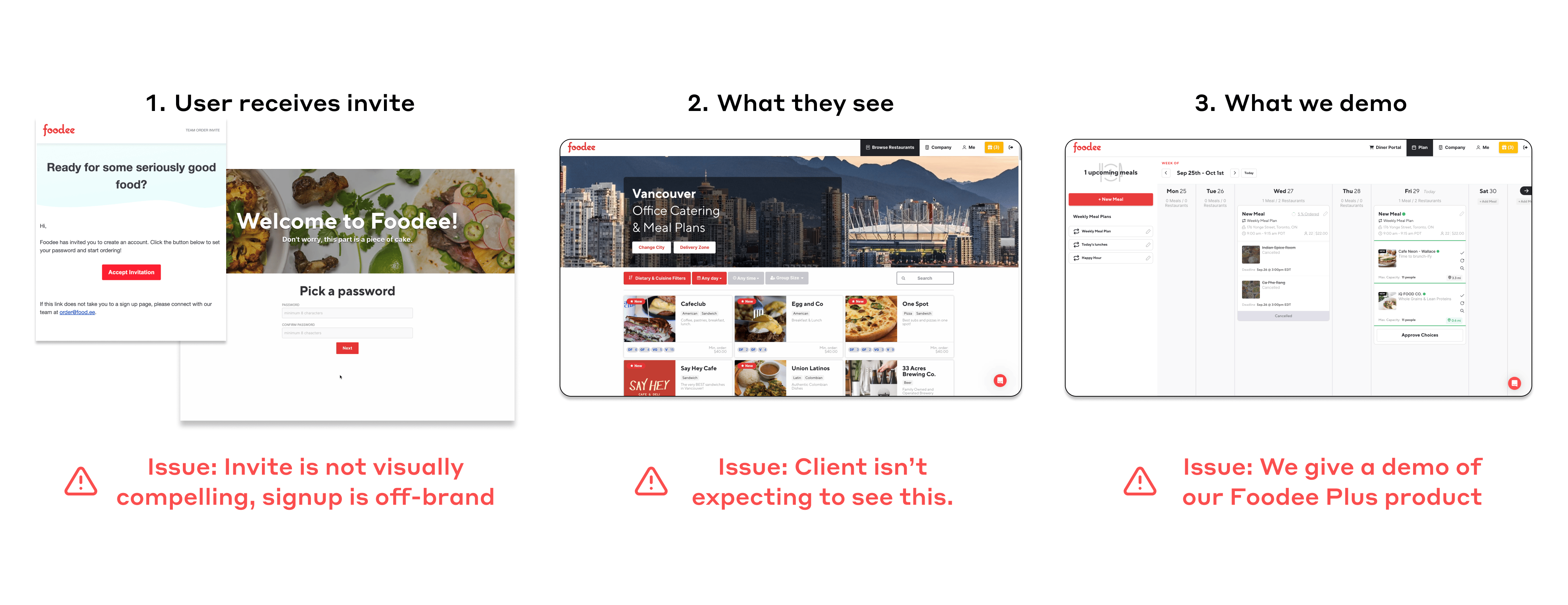
We were anchoring potential customers to a B2C ordering experience with the early invite, and then trying to sell them on the benefits of Foodee Plus which is a much more involved meal planning experience. A potentially hard sell given they've already been teased with something simpler.
Solution
1. Improving the sales workflow
Stopping this automated invite from sending would prevent this early distraction of the simpler Basic experience and allow the sales team to show off the Foodee Plus experience without confusing the client.
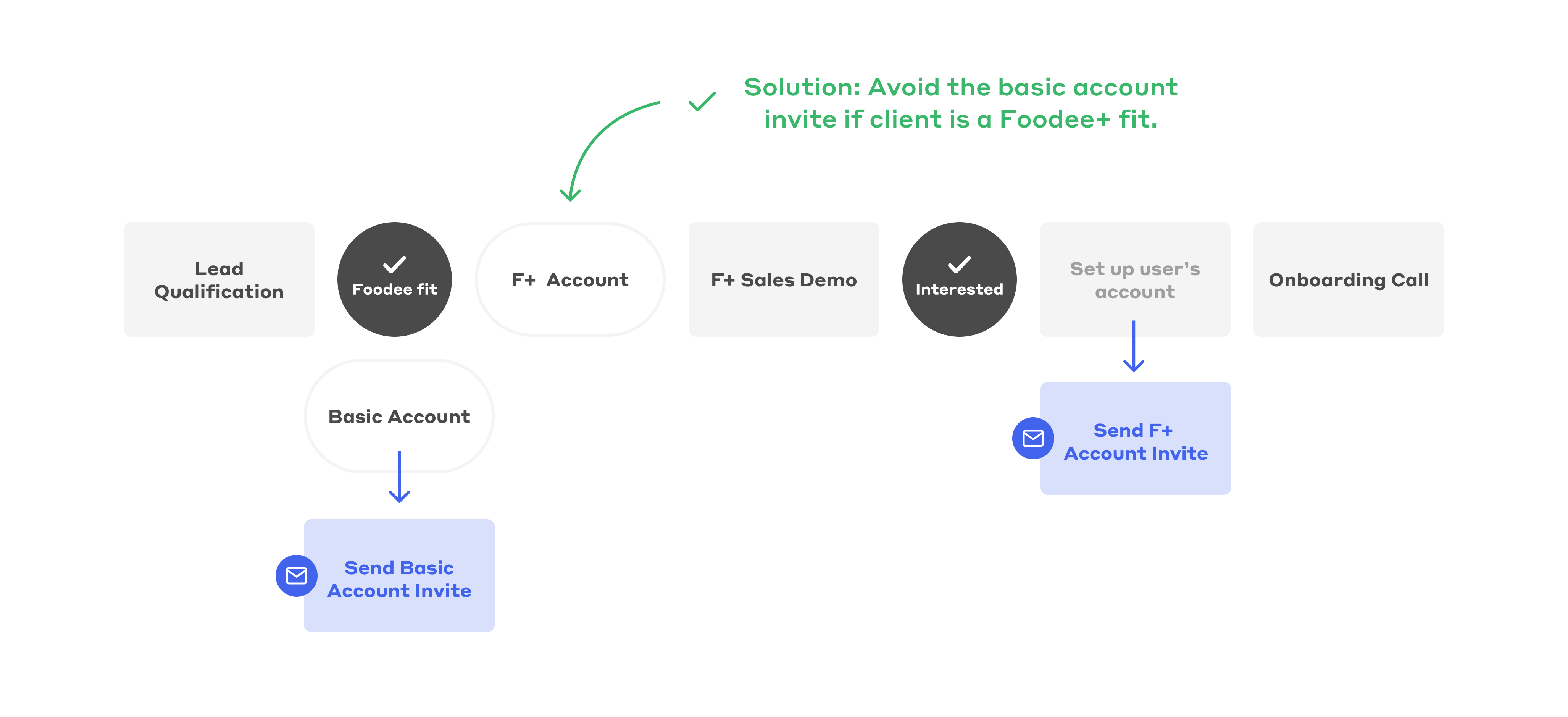
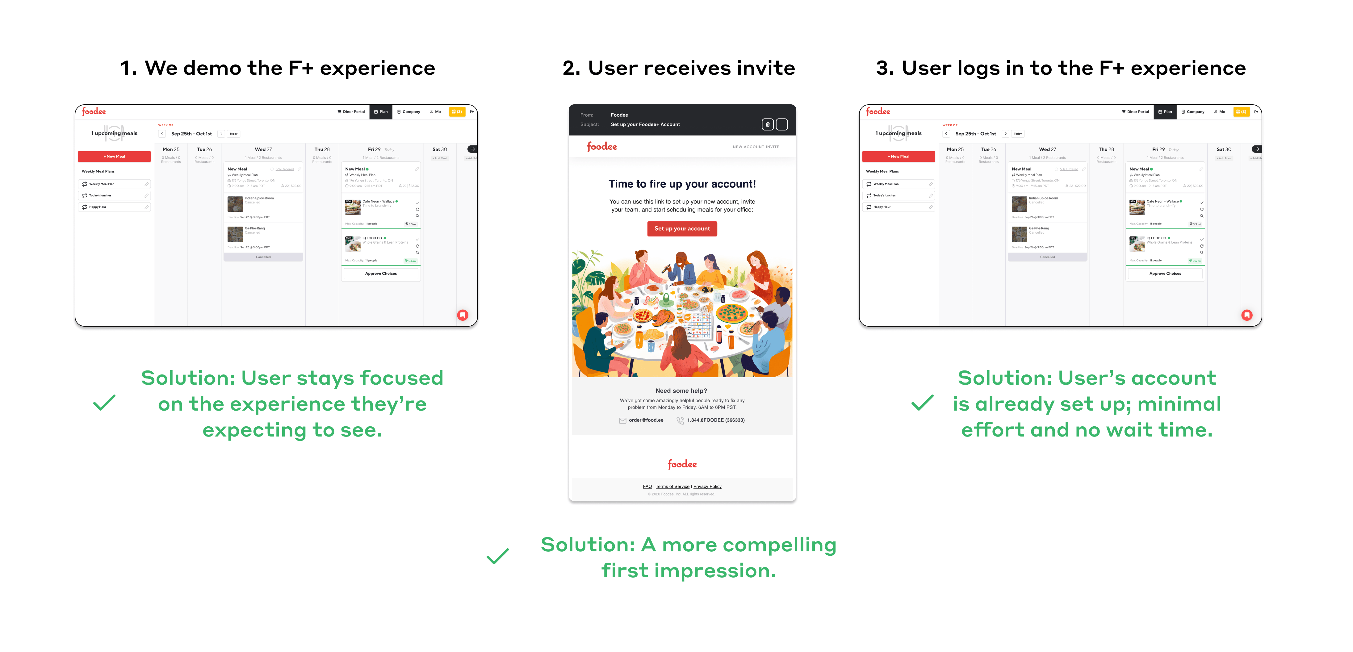
If a sales lead agrees to move forward with a Foodee Plus trial, sales could now setup their account ahead of time and trigger a newly redesigned invite email for a more impactful first impression and ensure a consistent experience from the time they receive a demo to when they log in for the first time.
2. Simplifying the account setup
Now that the sales team was prepared to gather account details ahead of time, the link for the existing onboarding flow was removed from our public facing website in lieu of showcasing more 'book a demo' opportunities on the marketing site. This meant we could reduce the amount of information we asked for so users could get into their new accounts with minimal friction.
Existing signup: 8 steps

Revised signup: 2 steps

Outcomes
Reduced noise, quicker process for sales
2 fewer days to close deals
Prev. 9 days (avg.)
86% reduction in abandoned signups
Reducing the amount of traffic going through a signup process helped the team focus on client success instead of wondering how to deal with so many abandoned accounts. The sales team was far more effective in ensuring that new Foodee Plus customers were onboarded properly and assisted with placing their first orders.
While the product team was eager to develop our product-led growth strategies, we accepted that this would be a quicker road to success while we planned further work down the line to rebuild our self-led onboarding flow.