Foodee
2023
Product Design
UX Improvements
Summary: As Foodee was looking to scale up, operational issues were creating a significant roadblock for the logistics and support teams.
The product team took a good look at our workflows to try and uncover what was happening and smooth out the kinks.
My role: UX research / strategy / design
The Problem
Confusing Emails / Missed Confirmations
Email was our primary means of communicating with our restaurant partners and over the years the details we provided were becoming muddy which created challenges for restaurants trying to keep track orders and causing many to miss (or ignore) a key order confirmation step.
What we learned
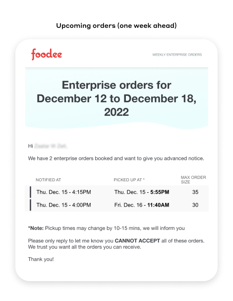
Feedback from our restaurants
"It's hard to keep track of orders throughout the week, can you show an order number on all the emails?"
"I get why you're showing 'Notified At' but it makes scanning difficult. The only detail that matters is the order pickup time."
"The order size is usually way off when I get the final order. Sometimes its only a few people, these aren't worth my time."
"It would be nice if each order had a link next to it that takes me to my dashboard"
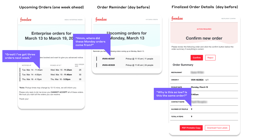
A confusing sequence of emails
We give you a heads up on Thursday for orders booked in advance, but more orders are booked after. Inconsistent details created a situation that made it difficult for restaurants to know which order was which as the week progressed.
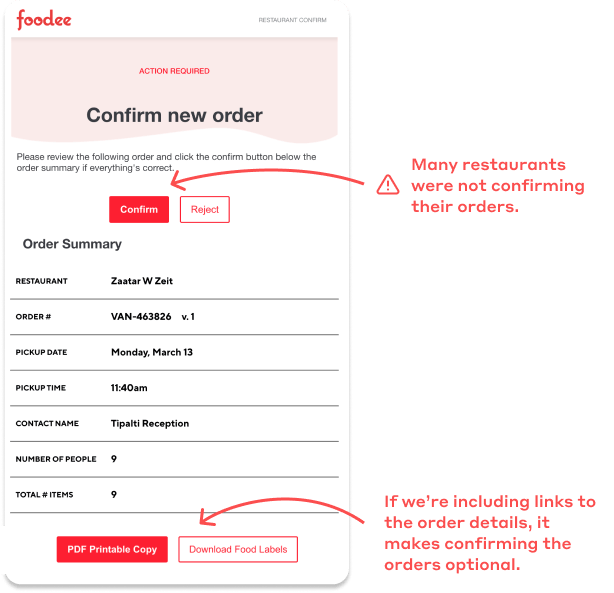
Error-prone confirmation
Foodee's support team was making more than 400 calls a month to get verbal confirmation on orders where this step was skipped.
While there was no single reason explaining why this was happening, it was clear that the email structure wasn't doing us any favours in preventing it.
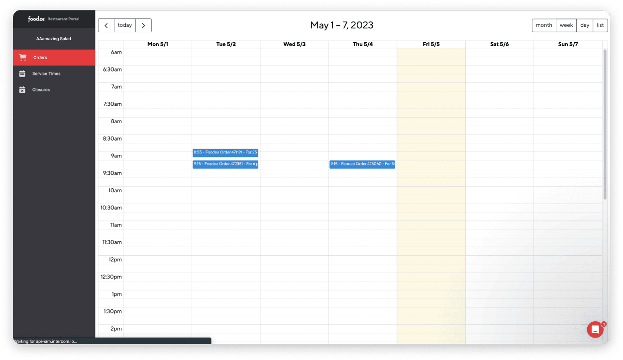
The existing restaurant dashboard
❌ No accounts or official login process made it hard to access your dashboard
❌ Limited functionality wasn't compelling users to regularly use the dashboard
❌ Weekly calendar had no indication of orders that may be sitting below the fold.
What did we take away from this?
- Our email design and structure had flaws that were simple enough to address
- It was acknowledged that email was not well suited for tracking orders where details are prone to change
- The team agreed that long term success relied on getting users to rely more on the app for tracking orders
Our Solution
1. Improve email clarity
Improving these emails was our number one priority as it was the established norm for our current users. Information hierarchy needed to be addressed to emphasize the relevant details. Technical changes were required to make sure order numbers could be included in all emails, which would make it easier for restaurants to differentiate orders throughout the week.
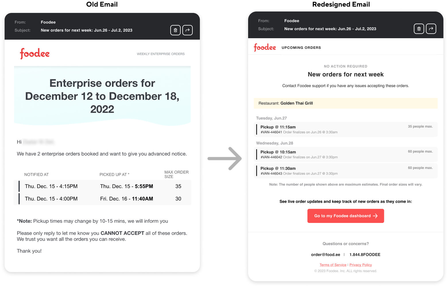
Clarifying order details
We reduced the information hierarchy to put emphasis on details that mattered most and added more clarity to our terminology. This made emails easier to read and scan quickly.
The key improvements here were to include the order # on upcoming orders (required technical changes since no order actually existed yet) and prominently showing a call-to-action that would drive users to their dashboard.
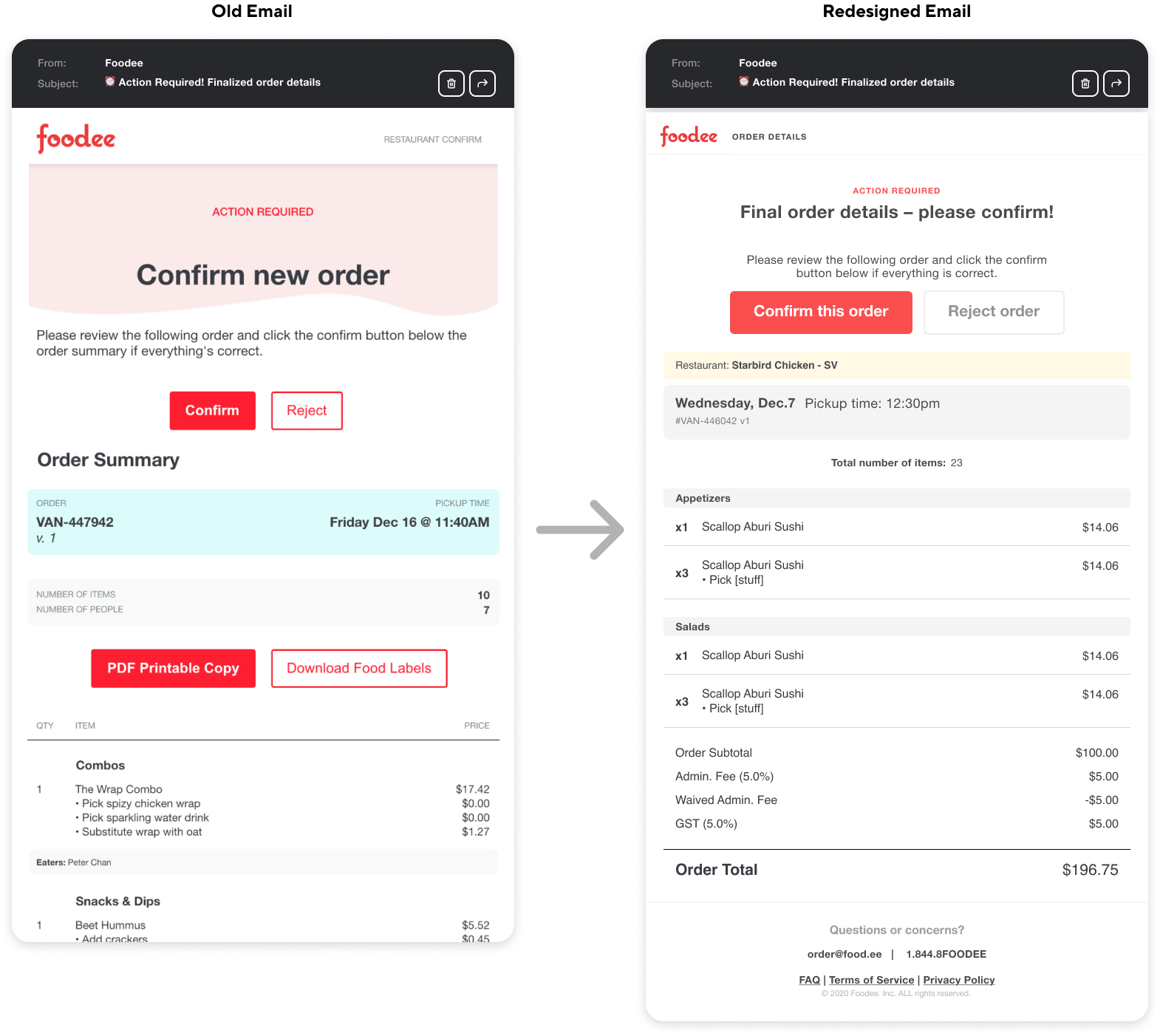
Requiring order confirmation (recommended change)
One change we considered was to make the user confirm the order before they could access the order labels and summary. Other changes we made to SMS notifications (see below) that made alleviated this issue enough that this was not pursued.
2. Mobile SMS notifications
We were aware that a mobile phone was most likely to be close at hand for any restaurant user, regardless of whether they used their dashboard or relied on email. This was an easy place to target for quickly notifying restaurants about important details.
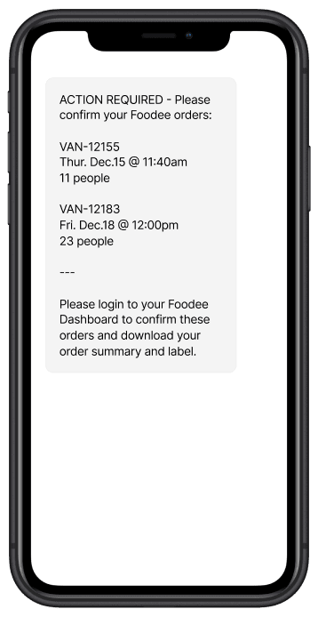
A simple reminder
Foodee's SMS system was already functional, so creating a new SMS notification to remind restaurants if they had orders that needed to be confirmed was an easy improvement.
3. Improve "in-app" awareness / engagement
Since order details are often not static; emails quickly go stale and create potential for confusion or mistakes. Pushing more users into the dashboard would give them the most up to date order information at all times. The dashboard itself already existed, what remained was targeted improvements to increase adoption.
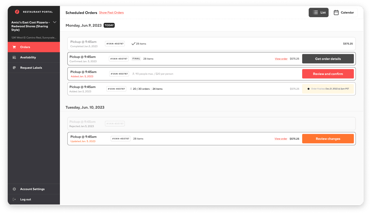
The updated restaurant dashboard
✅ A new authenticated user system helped us establish and track usage in the app
✅ Manage / invite users and switch between multiple accounts
✅ Clearer order details, an improved default list view that handles majority of use cases.
Outcomes
More order confirmations / increased account adoption
Confirmation calls reduced by 51%
224 calls/month > down from 454 calls/month
Manual confirmations were no longer sapping productivity and clarity of order details across various touchpoints was a huge quality of life improvement for our restaurant partners.
78% of restaurants accounts activated
Previously none
We implemented an authenticated user account system for restaurants This made accounts more secure and easier to track individual engagement in the future.