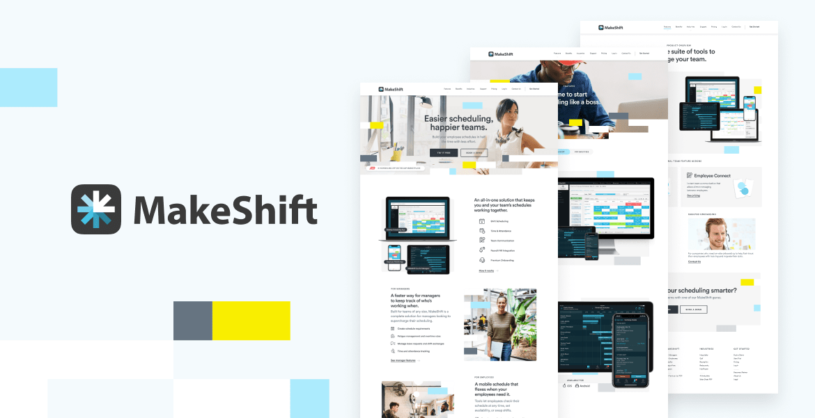
MakeShift
2020
Agency: DDCo.
Marketing Site
My role:
Visual Design
Motion Exploration
Makeshift was a B2B scheduling and timetracking product that was in the process of overhauling their content and in need of a new look. Delichte Design Co. asked me to help them redesign the website to breath new life into this established product.
Art direction: Darren Delichte, Jason Delichte
Context
Existing site in need of a facelift
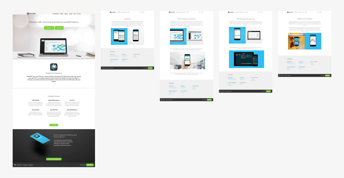
The original site was designed over 10 years prior to me getting involved, and part of the reasoning for a redesign was the appearance feeling well past its prime. It had served the Makeshift product well, and now the company was looking to improve the content and refresh the visuals for a more current look.
Early Planning
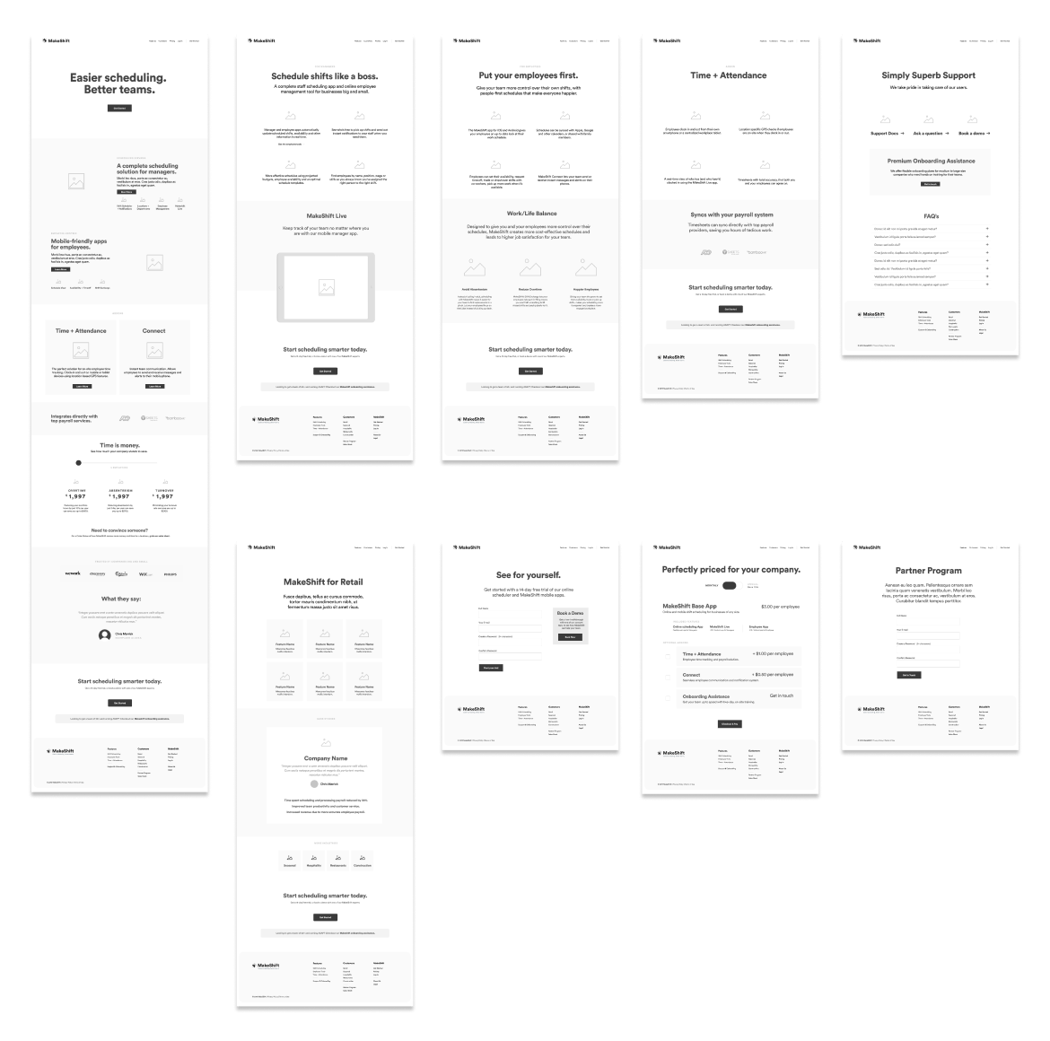
Wireframes and page layout
These wireframes helped the team start to see how we could reorganize the content and lay it out on the page. The previous site had quite a lot of copy on it, and my goal was to give content writers a look at a target length they should be aiming for and also help them understand how/where each feature was going to sit.
Early Designs
Exploring visual styles
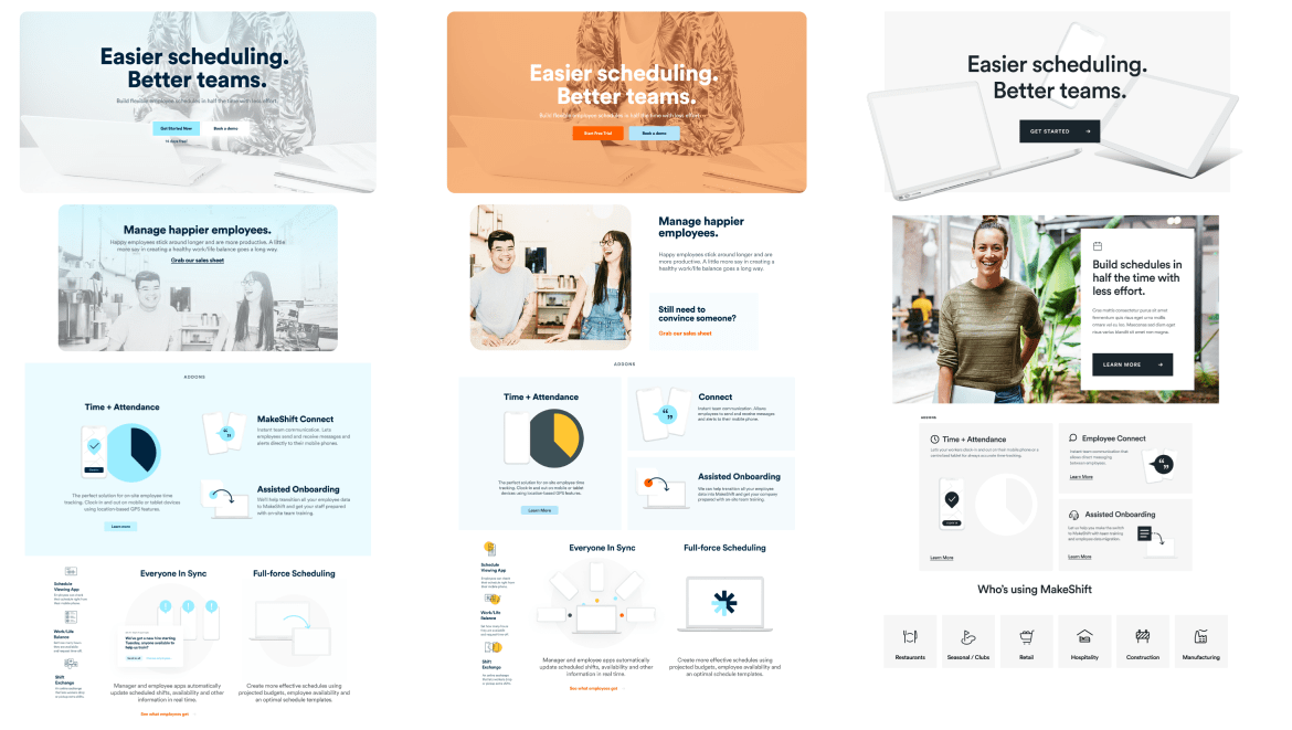
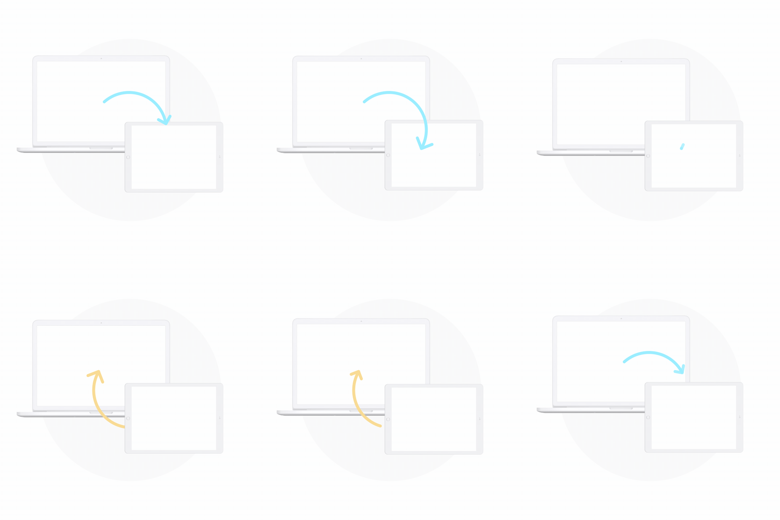
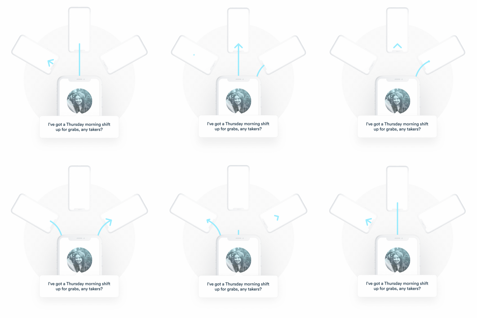
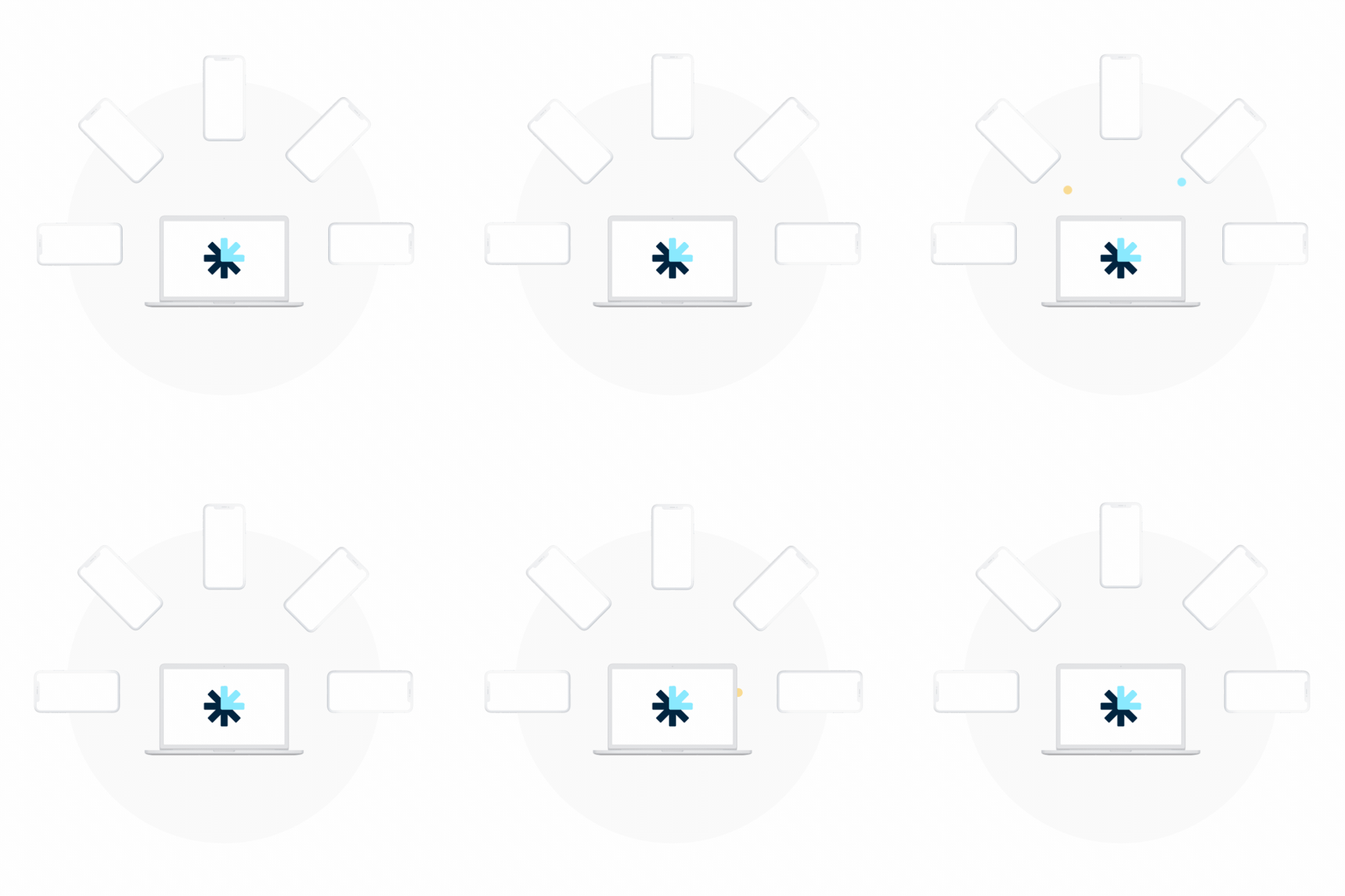
While content revisions and editing was going on behind the scenes, I started to pull together a range of visual options for updating the old site aesthetics. This also allowed me to explore potential for spot illustrations with motion design to sell some of the features. The directions I proposed would help add energy to the brand and more variety to the page layouts.
Style exploration
Motion Exploration
Our Solution
Expanding on the chosen direction
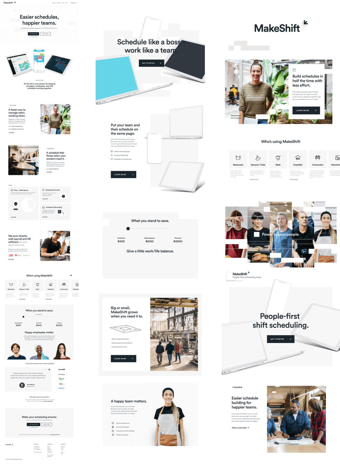
The neutral colors and natural looking imagery was the preferred direction as it felt more of an evolution of the website than a wild departure. We then took this approach and explored further layout and imagery options that we could bring into the final page design.
Defining the design style
The team was enjoying how the new look was coming together, but something was still missing. With a lack of a styleguide, I thought it would be a helpful exercise to create a stylescape. This served as our moodboard and helped us integrate a new visual motif resembling cells of a spreadsheet which integrated brand colors and balanced out the minimalism.

Our Solution
A fresh new look
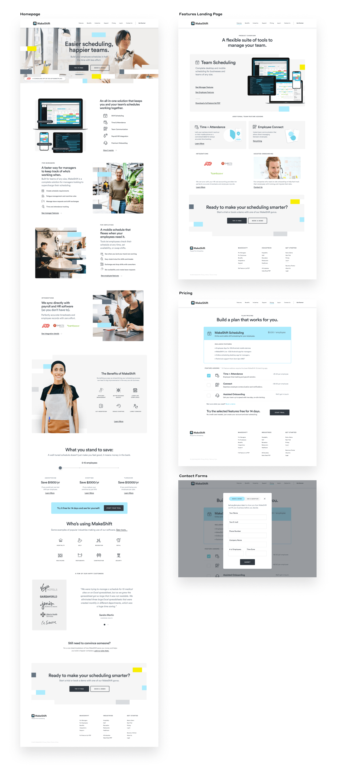
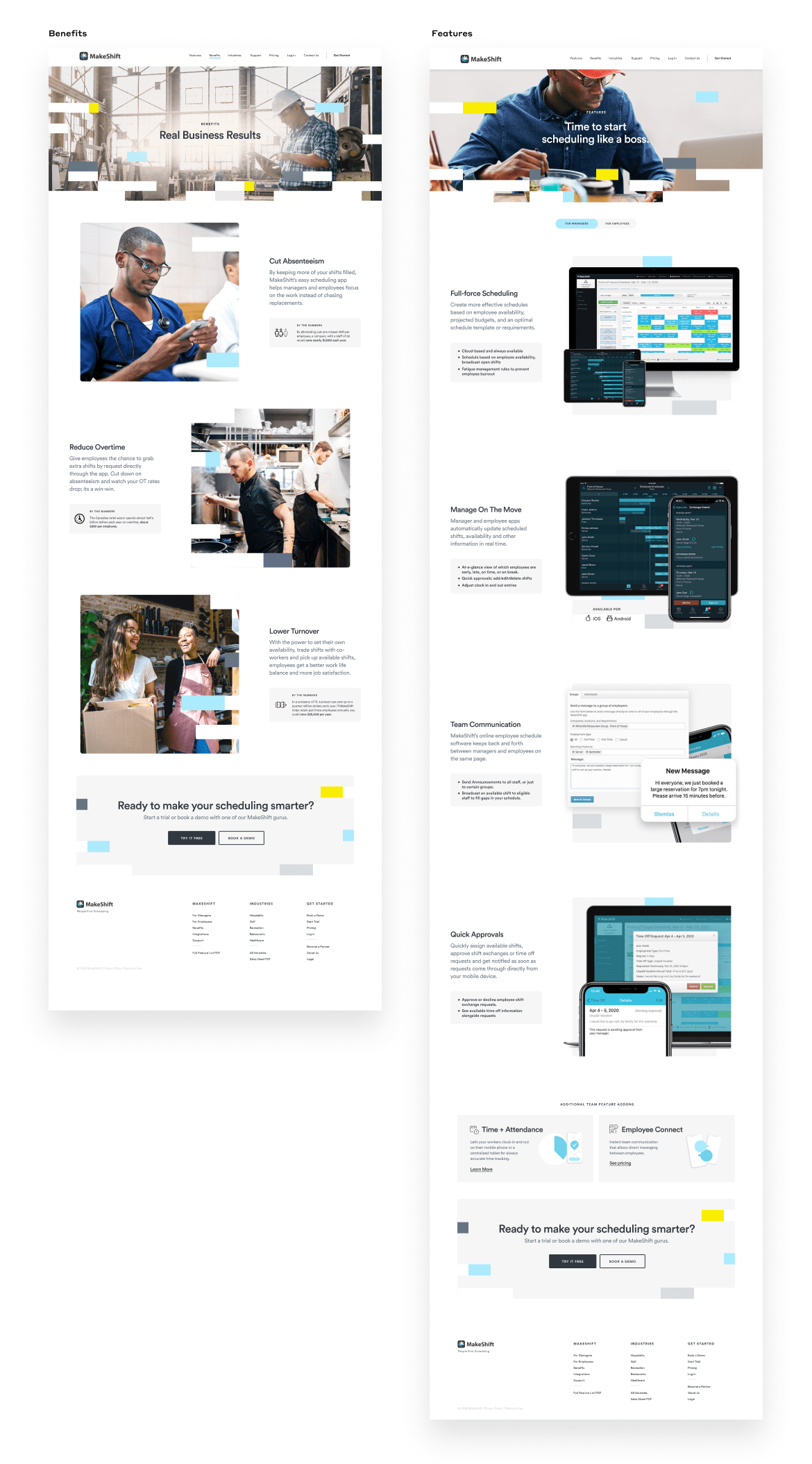
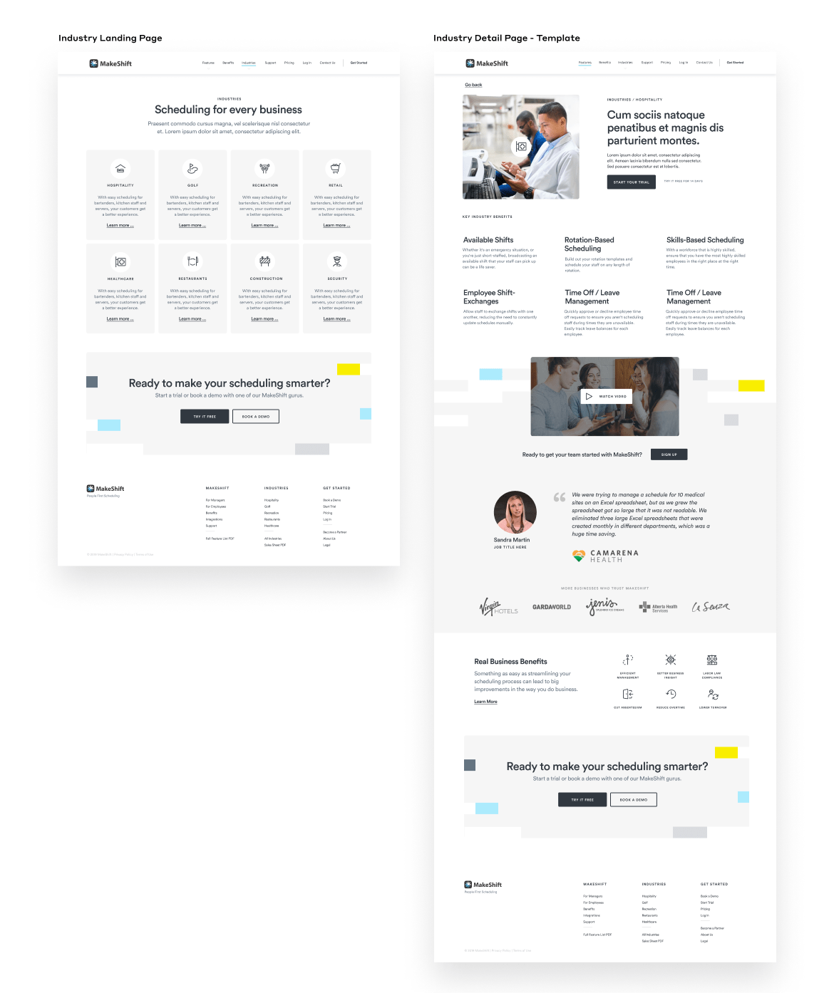
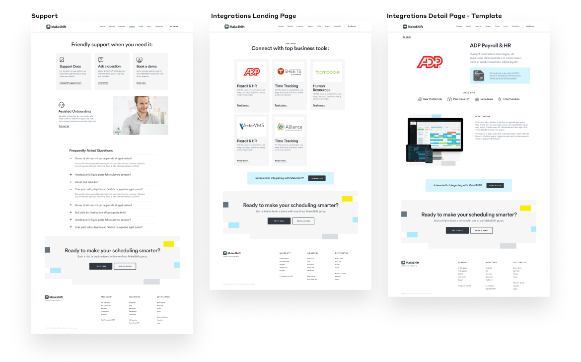
The final result leaned into approachable lifestyle imagery and a clean, minimal look. Modern typography, new iconography, and restyled feature imagery would breathe life into the old brand and site.
