Food.ee
Product / UX
Over the span of 3 years at Foodee, I helped the product team plan and execute a range of improvements that would help streamline account onboarding and increase user engagement.
My Role: Senior Product Designer
Responsibilities: • User Interviews • Usability Testing • UI Design • Content Strategy
Context
Foodee was shifting their focus from small teams of less than 30 people to larger, multi-site accounts. This meant a lot more mouths to feed, and a lot more buttons being clicked.
The challenge: New enterprise accounts were larger and more complex, and our existing methods of onboarding were creating bottlenecks, incomplete signups, and a poor user experience.
Process and Discovery
Uncovering opportunities through users
Qualitative and quantitative insights were critical in helping the company understand what users wanted, and identify the biggest opportunties for improvement.
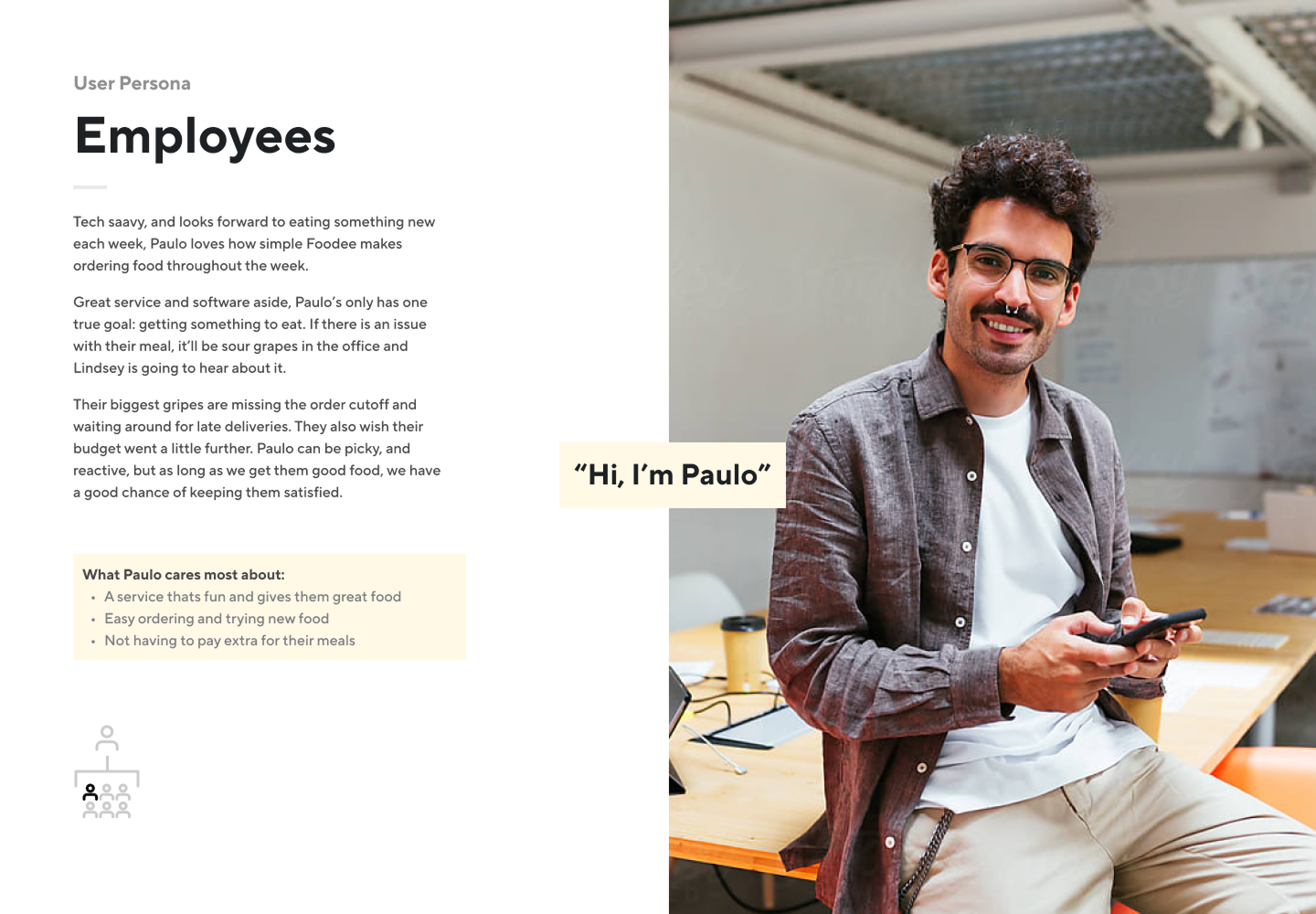
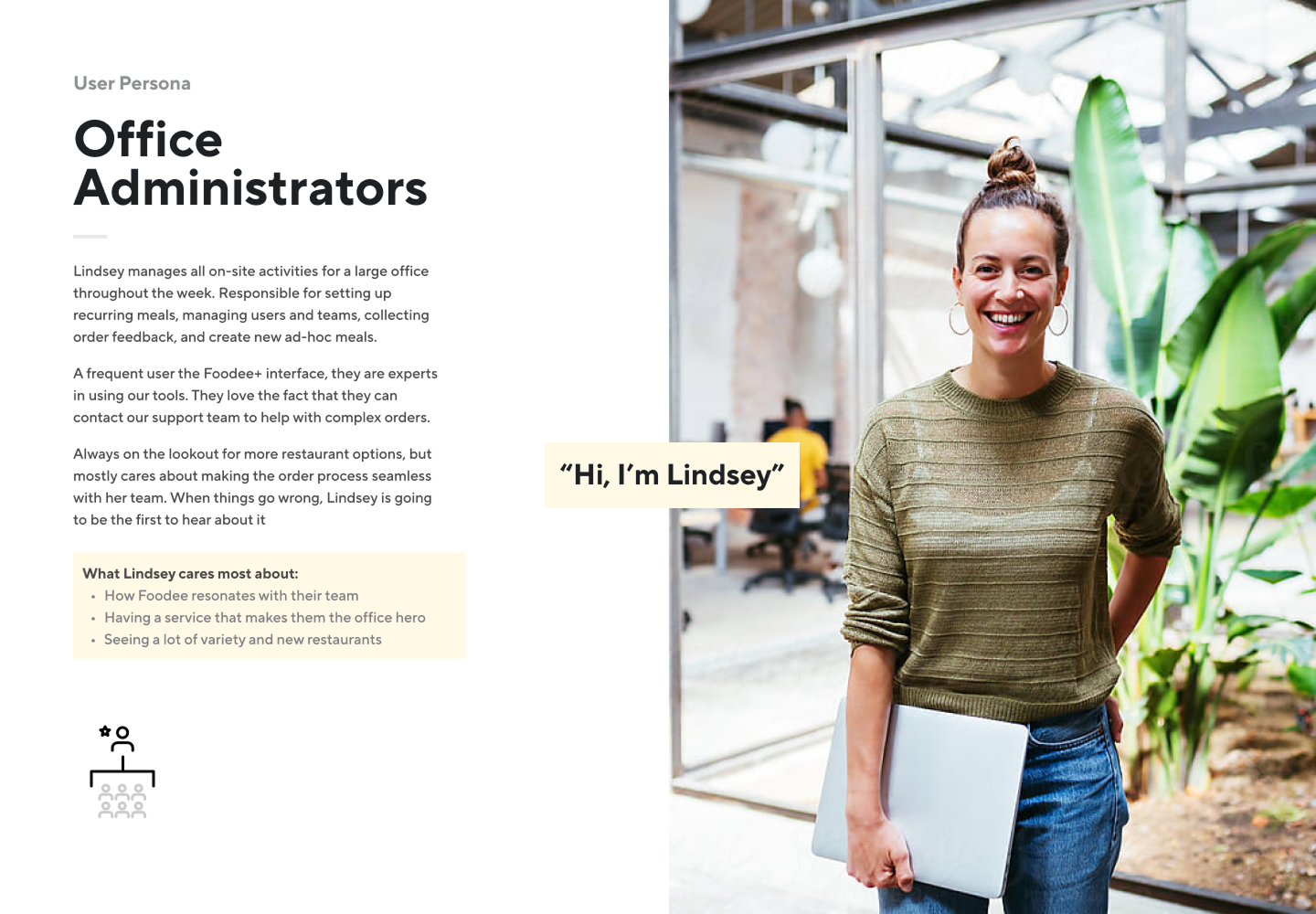
Interviews + User Personas
We created our personas with two key principles in mind: keep them simple, and focus on roles rather than personality traits. We wanted to capture what users needed from the product — not who they were as individuals.
One thing that quickly became clear was the wide range of motivators. For some, they cared most about ordering and enjoying meals. Others were operational – focused on tracking usage and reporting performance.
Recognizing these differences helped us shape our communication, features, and support based on who we were talking to. It also ensured that all teams at Foodee stay aligned on what each user cared about most.

Journey Mapping
Foodee workflows were complex, and the full experience extended well beyond the product. Journey maps captured the key stages our users followed and highlighted opportunities and showed how the multi-stage process unfolds.
It uncovered opportunities for the service, and also showed the product team how we could keep users positively engaged during onboarding.
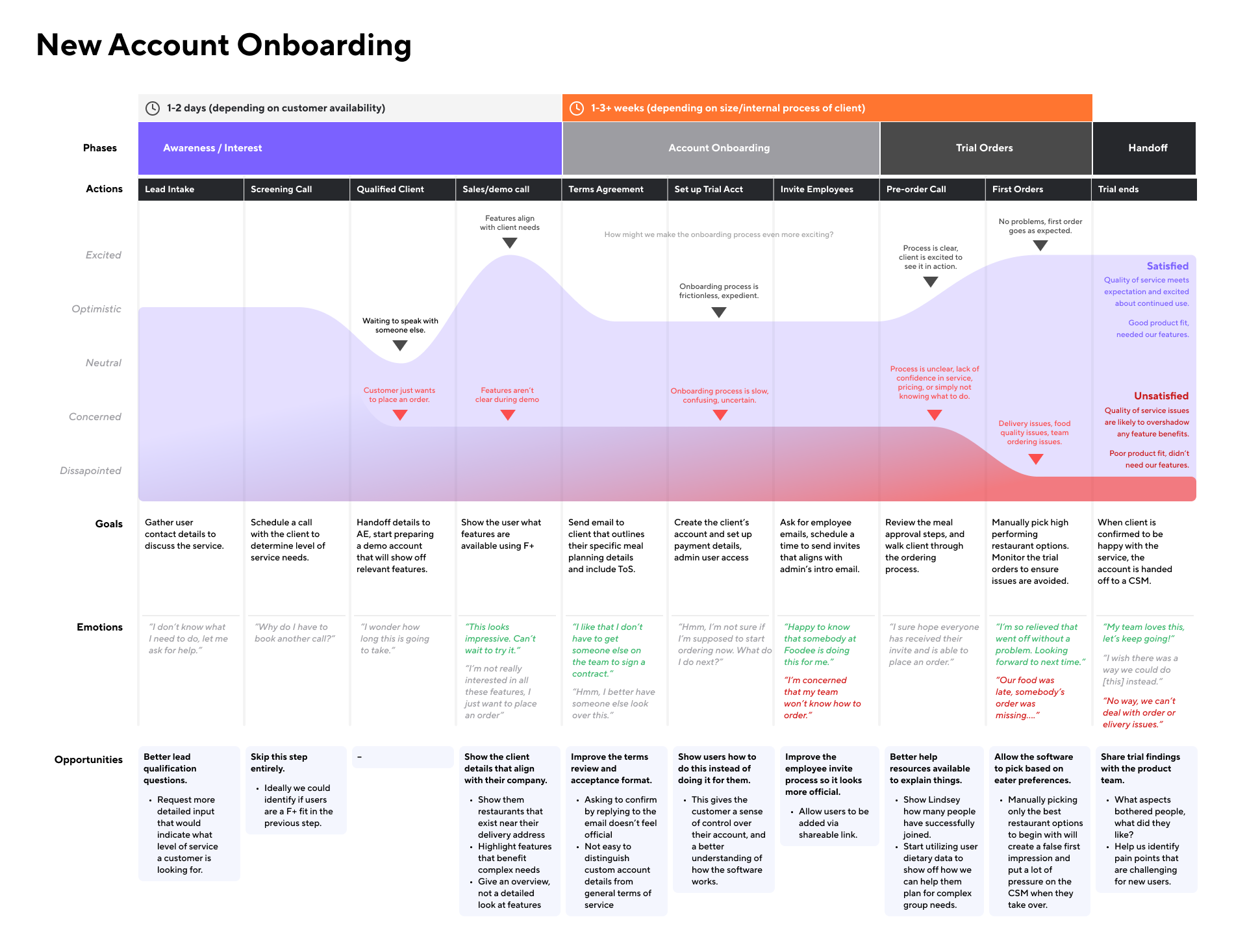
The product team used these insights to propose a mix of usability improvements and process overhauls that would address internal pain points and create a better user experience during onboarding.
Solutions
1. Streamlining account onboarding
The original Foodee onboarding form was dense; 7 steps of detailed questions that were designed to gather as many details upfront in order to avoid the need for input later.
⚠️ The problem: Data showed low engagement was creating incomplete account details.
The existing signup flow was adding noticeable friction and produced inconsistent results. In turn, these incomplete signup details created a lot of extra work for Foodee teams to correct.
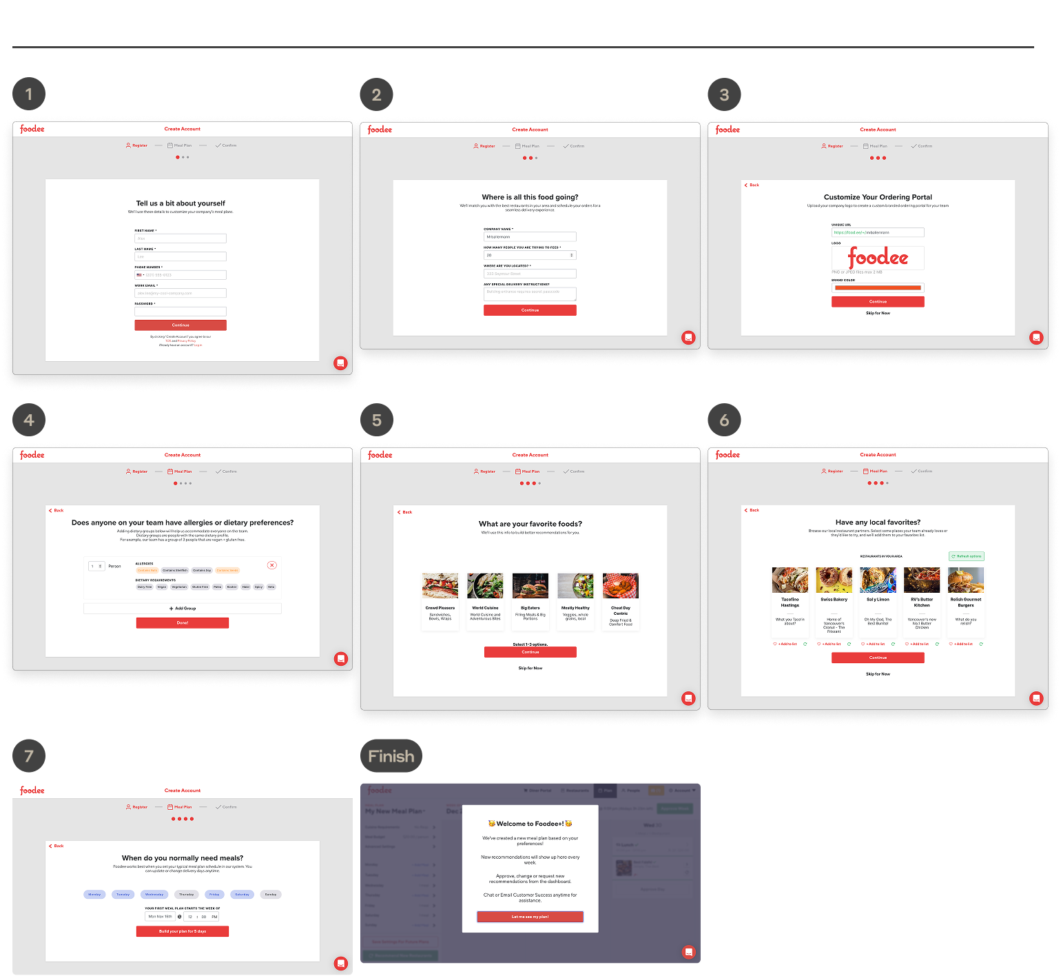
✅ Our solution: Simplify the onboarding to get users into the app faster with less friction and more personality – only asking what's necessary to create the account, and save the rest for later.
The new flow in action:
2. Making key features discoverable
⚠️ The problem: Our existing UI did not expose helpful features.
Our most valuable features for large accounts were rarely discovered by users. If we expected to reduce the workload for our internal teams, we needed to make sure these features were found.
✅ Our solution: Revise our meal planning dashboard to highlight valuable workflows.
Our goal was to be clear, but not overwhelming, using subtle calls to action in order to showcase key tasks such as inviting their team, creating recurring meals, and confirming their orders right on the dashboard.
The new dashboard:
3. Get users to what they want most
⚠️ The problem:
"Why can't I just see the restaurants?"
Our users wanted to explore, but our existing meal setup flow demanded too much information before you could see any restaurants. A logical approach in theory, but it was proving cumbersome and frustrating for users.

✅ Our solution: Let users see restaurants in as few clicks as possible and maximize the number of restaurants they see before asking for details that would reduce options.
The new workflow:
The only detail we absolutely needed was an address – everything else could be added progressively which would then narrow down their results. This gave our users much more confidence that we were showing them the entire set of restaurants.
Outcomes
Results & Impact
With our improved workflows, onboarding completion rates increased from less than 10% to over 70%. With the assistance of sales and a new outreach process, we managed to achieve over 50% of new accounts placing a successful first order.
What was most interesting is that like our users, our internal teams had diverse motivations as well. The Sales team was hesitant to change their onboarding process, the Development team favored (logical) rigid requirements over (illogical) user behaviour, and leadership didn't see the value in improving anything that was already built.
Getting buy-in across our stakeholders was an ongoing effort, which taught me a lot about how to present ideas that resonate with different audiences based on what they are hoping to achieve.